Belgian election fever: reflections on extremism and their outdoor print ads.

Election in Belgium

Election in Belgium

Belgium is heading towards elections

Regardless of the fact that we are facing elections again in Belgium, I want to discuss the outdoor print poster of the right extremist party. For your information, they’re very nationalist. They rather see the northern (dutch-speaking) part of the country become a separate state instead of cooperating with the southern (french-speaking) part. Their driving factors are: a different language, a differently organized economic structure, money that flows from the north to the south, etc.

Language at the core of the party program

As stated above, language is a major point in their (ehrm) “ideology”. So they state in their posters: “Flemish people first” – written as “Vlamingen 1st”.

Problems with this statement

Either they make a dutch spelling mistake or they introduce English (1st, means first) into their campaign… Isn’t this a bit strange for a party who has Dutch language at the core of its existence? The ambiguity is clear to me…Empowering the stupidity of the right-wing.

A situation where I could have understand this approach

I could have understand this poster without worrying when the party had received list number 1 for the election. From a marketing point of view, the big 1 would have made clear that they were the first party on the election sheet. Nonetheless, they are not. They received number 7. The irony in here is that number 1 was granted to the flemish social-democrats – their ideologic counterpart.

Share

On media selection. Radio ads for universities.

Radio advertisements

When talking about advertising on radio, one needs to know a few things about the medium and its audience:

  • people mainly listen to the radio while driving a car
  • the other 50% of ‘hearing’ the radio is while they are working
  • teenagers do not drive a car
  • teenagers listen to their Ipod or play with their Iphone (social web apps) while taking the bus, the train or driving their bike.

Why do universities advertise on the radio?

The main goal in university ads is to convince teenagers to sign up for classes at their school. As stated above: teenagers do not listen that much to the radio. Why on earth would one buy expensive media space on national radio if the message doesn’t reach your target audience?

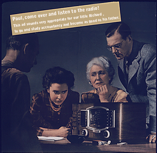
It might be that parents have a great influence on the university teenagers join. It might just be that those same parents do listen to the radio while driving their car or working. It might just be that radio spot rings those parents bell… I assume the target audience (teenager) have things like a Facebook fan page, a YouTube movie library of the university’s infrastructure and activities, a flashy banner on a certain website, an architectural booth at a trade fair, …

Why marketers better be sociologist

I suggest to read the above paragraph.

radio advertisement - influence on buying process

radio advertisement - influence on buying process

Share

Future of print: Large Format Sexy Ads!

Fact: printed matter is going down

Future of print is large format

Future of print is large format

Have a look at the amount of brochures, catalogues and newspapers that are printed today – compared to 10 years ago. Indeed, commercial printed matter decreases year by year. Of course, packaging printing will continue to exist. You can’t deliver without properly packing the good. But you can sell without a printed brochure or catalogue (just put it online as a PDF and it’ll do the trick).

Fact: large format prints add value

In the above I stated that packaging will continue to exist. This will also count for large format print. Large format prints provide additional value compared to commercial prints. Large format prints grab the attention of people. A brochure isn’t read thoroughly anymore – after all, they find the content on the world-wide web.

Suggestion: sexy large format prints

Sexyness has always been a trick to grab people’s attention. Nevertheless, sexyness should be used appropriately. It doesn’t make sense for all products. This page depicts a good example of sexyness within a large format print concept. It depicts a good-looking women next to a big shower head. The copy (Feel Dirty?) enforces the “sexual” aspect as well as it provides appropriate information about the company’s products: they provide solutions to make your body clean…

Share